GIS (Geographic Information Systems) offers an innovative approach to historical research, playing a crucial role in overcoming traditional biases associated with textual sources. One of the key advantages of GIS is its ability to visualize spatial relationships and lived realities that might otherwise be difficult to conceptualize through written accounts alone. In my opinion, the greatest benefit of GIS is its capacity to create comprehensive historical records that span across time. This enables historians to observe patterns and changes over extended periods, adding depth to historical analysis that purely textual or static sources may lack. The combination of GIS with historical research opens up new possibilities for understanding the dynamics of social, political, and cultural developments, allowing researchers to see not just isolated events but the broader contexts in which they occur.
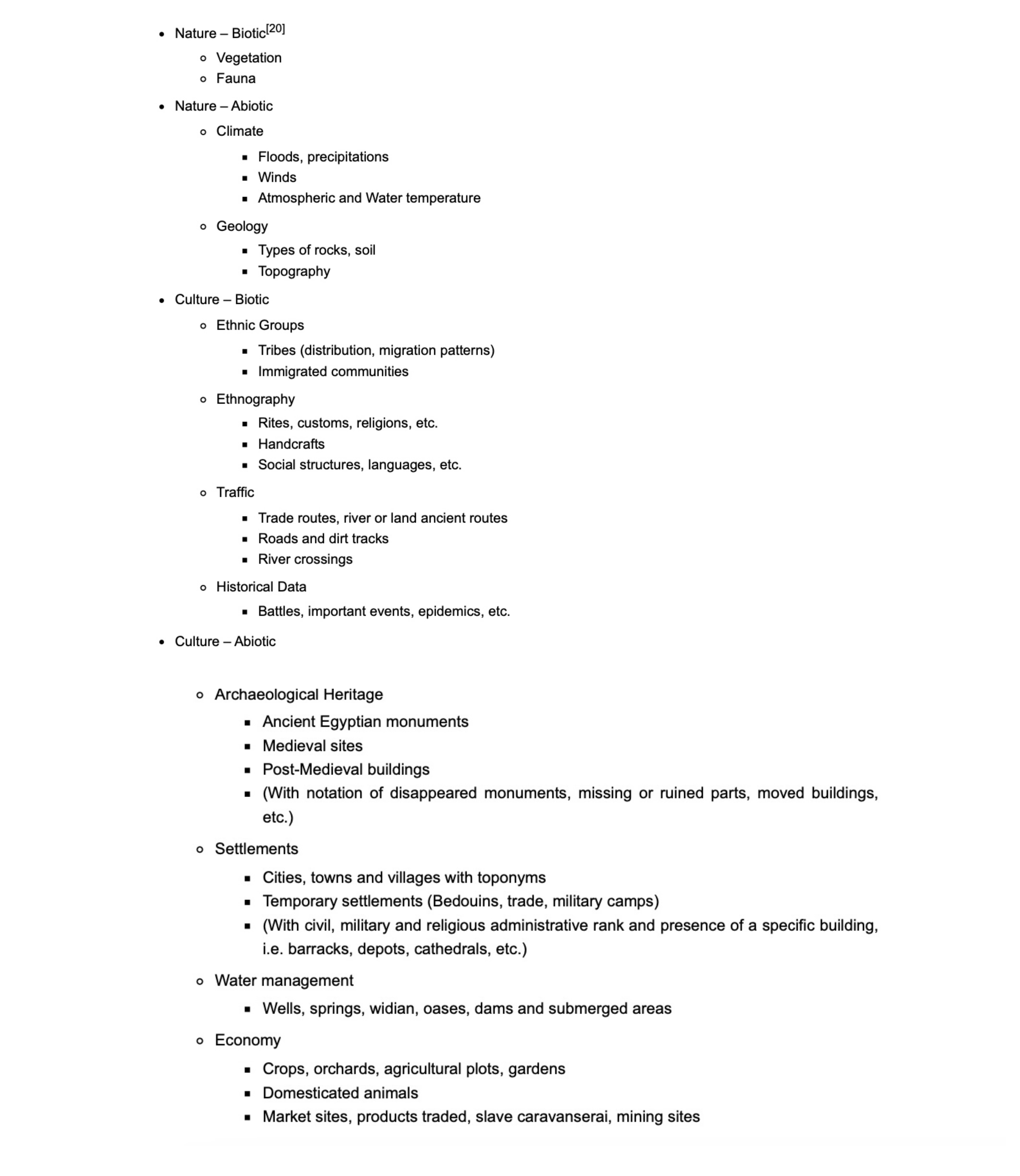
An excellent example of GIS’s potential in historical research can be seen in projects like Tokyo’s Spatial History and Nubia. These examples illustrate that GIS is not merely a geographic mapping tool; rather, it is a multifaceted platform that brings together data across disciplines, providing a more holistic view of the past. For instance, in the Nubia project, GIS integrates both geographical and non-geographical information, allowing researchers to explore the intersections of environment, society, and culture over time.
Specifically, I found great value in the categorization of Nubia’s geographical and non-geographical information. I think this classification applies to any GIS project in any region.
Furthermore, GIS is instrumental in overcoming traditional textual biases by providing a more tangible representation of historical data. Textual sources often present a one-dimensional view of history, focusing on isolated events or perspectives. However, GIS allows historians to visualize how people interacted with their environment and each other, uncovering patterns that may have been invisible in a purely textual analysis. For example, by mapping census data, historians can observe not only the proximity of neighbors but also the broader social and economic relationships within a community. Such visualizations highlight the spatiality of daily life, revealing dynamics like inclusion, exclusion, and barriers to access—factors that might otherwise go unnoticed in text-based research.
Despite its many advantages, GIS is not without its challenges. One of the most significant issues is that the availability of data can lead to new biases. Researchers may focus on areas where data is easily accessible, neglecting less privileged regions or groups whose information is harder to obtain. This path of least resistance means that GIS projects may disproportionately represent well-documented or privileged populations, further marginalizing those already underrepresented in historical records. This is a particularly important concern in digital history, where the focus tends to be on data-driven research. If the data is limited or incomplete, the conclusions drawn from it may also be skewed. Historians must therefore remain mindful of the potential for new biases when using GIS and strive to balance the richness of the data with a critical understanding of its limitations.
Moreover, working with GIS can be a complex and resource-intensive process. Building a GIS project requires time, energy, and significant financial investment. The software tools, such as QGIS, are incredibly powerful, but they demand a high level of expertise. For researchers with little digital experience, the learning curve can be steep. This is particularly true when confronted with poor-quality GIS maps or overly complicated visualizations, which can obscure rather than clarify historical insights. In my own experience, encountering blurred and complex maps, such as those in the Tokyo’s Spatial History Map, can be frustrating and may even discourage further exploration. While QGIS and similar tools have made significant strides in improving map editing and visualization, accessibility remains an issue for many researchers.
In conclusion, GIS is a powerful tool for advancing digital history, offering historians new ways to visualize and analyze historical data. By overcoming textual biases and revealing spatial relationships, GIS can provide deeper insights into the lived experiences of historical populations. However, it is essential to recognize that GIS is not a perfect solution; it introduces new biases and requires significant resources to implement effectively. Therefore, while GIS holds great promise, it should be used critically and in combination with other research methods to ensure a balanced and comprehensive understanding of history.
Leave a Reply